In version 2018 former graphic headers displayed on all webpages were replaced by graphic teasers. Graphic teasers are displayed only on home page and its main purpose is presentation. Therefore, take time when setting it! In this article you may learn where to find the setting and how to adjust it.
Visual Aspects
Start by choosing visual aspects of website. It sets the visual aspect of teasers as well. Now you may pick out of two options:
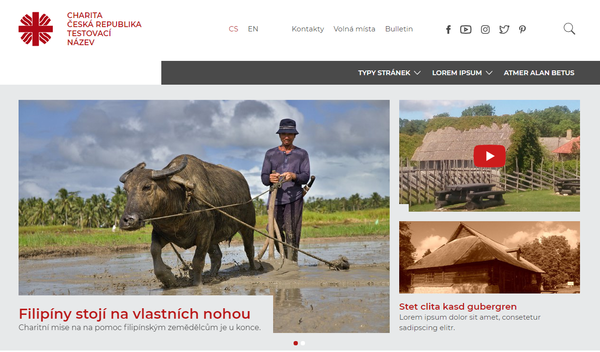
1) Monochromatic background that overlaps bottom-left part of photograph. On the background you may put headline, text, or highlighted button.
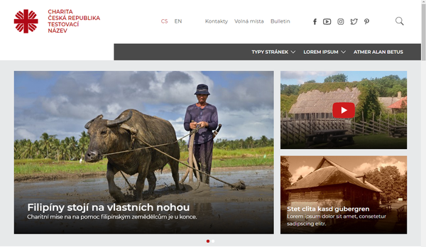
2) Gradient shadow in bottom part of photograph. Headline and text are aligned to left.
To switch the options, go to CMS3 > Website Setting > Visual Aspects of Menu Items.
Options
It is important to choose a photograph carefully. One photograph does not always suit both for big teaser and option 1+2. Let us go through options first and in the following part through the setting itself.
Big Teaser (1)
A photograph across the whole page width may contain headline, text, and button. In case there are be more teasers entered, they rotate after the time you have set.

Teaser and Two Info Boxes (1+2)
In case you want to promote more information at once, you may use option 1+2. The big teaser is reduced to 2/3 of page width and two info boxes appear in the created space on right.
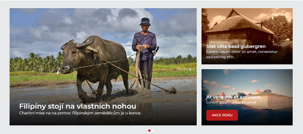
Also, this option enables rotation of bigger teasers. Small info boxes may contain headline, text, or button. You may also switch off any of the previous features.
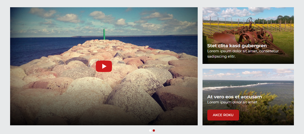
Another option is a big teaser with link to video on YouTube without any headline or text (on click the video is played on your website). Options for small info boxes are headline with text and headline with text and button. You may combine both teaser and info box based on what you fill in.
Setting
If you activate info boxes, graphic teaser is automatically reduced to 2/3 of its former size. It means the secret of switching between big teaser and option 1+2 is only about (de)activating info boxes.
Big Teaser Only
In case you want only one big photograph (optionally with headline, text, button) displayed? Go to CMS3 > Graphic Teaser > Info Boxes to deactivate all info boxes.
Teaser and 2 Info Boxes
In case you want a teaser (photo optionally with headline, text, button) and two small boxes displayed? Go to CMS3 > Graphic Teaser > Info Boxes to activate two info boxes.
Teaser Management
To manage list of all available graphic teasers, go to CMS3 > Graphic Teaser. You may add/delete, activate/deactivate them here, and define their order and properties. The list may contain both activated and deactivated items. Activated items rotate after the time you set. Deactivated items are not displayed anywhere, but you may use them later e.g. in case of periodic events. We ask you to delete teasers you do not need anymore.
Info Boxes Management
Go to CMS3 > Graphic Teaser > Info Boxes to manage info boxes. You may add/delete, activate/deactivate them here, and define their order and properties. You may have stored more items in the list of info boxes but activate only two of them - there is a logical reason for that: only two boxes may be displayed. Info boxes do not rotate. In case more than two info boxes are activated, first two in the list are displayed.
Content of Teasers and Info Boxes
Every teaser and info box are based on a photograph. You may add headline, description, and button on a photograph. A photograph may be without additional content or may be used as a highly visible link to a video on YouTube.
There are examples with instructions:
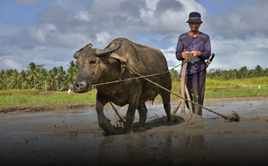 Option without content (also without a link):
There is no use for this option, it serves only as an example.
- fill in “Name”
- check off “Display as banner” in the setting
- do not fill anything else
Option without content (with a link):
- fill in “Name”
- check off “Display as banner” in the setting
- fill in “Button / Link”
Option with Headline and Link: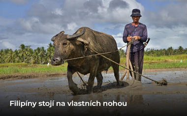
- fill in “Name”
- fill in “Button / Link” (after you fill in the link, the photograph becomes a highly visible link)
Option with Headline (without Link):
There is no use for this option, it serves only as an example.
- fill in “Name”
- do not fill anything else
Option Completely Filled In: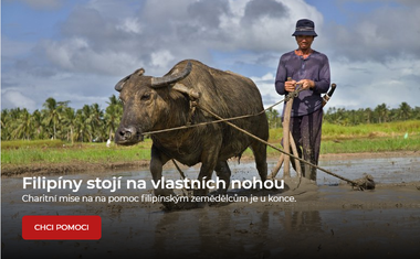
- fill in “Name”
- fill in “Content”
- fill in “Button / Name”
The whole photograph has the same link as does the button. It would be confusing for users if the link on photograph and on button would have directed them somewhere else.
Option with Link to YouTube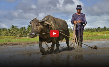
- fill in “Name” (in case you do not want it displayed, check off “Display as banner”)
- either fill in or do not fill in “Content”
- fill in “YouTube / Link”
Attention. In this option button is never displayed,
not even when filled in.
You may fill in other options likewise. Each item is optional.
