A new option was added to easily and quickly put together a modern design and, above all, high-quality, responsive website. Pages can be composed using individual boxes, which we can think of as virtual blocks that have different content and different functions, that we can easily add or change their order or disable them both temporarily or permanently.
Example of usage
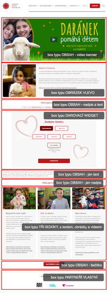
 On the right, there is an example of a Landing page, composed entirely of boxes. The individual boxes used are separated by red rectangles for a better idea. In each box there is a label identifying the chosen type. In addition to the basic content boxes, where you can place any content using the editor, i.e. from headings, texts, images, to lists and even videos, boxes with new functions are used, such as a donation widget, connected to the charity's own payment gateway, or to Darujme .cz and also a box of the "three boxes" type, which simply and clearly divides the content into three equal parts. At the bottom, you can find a box with the "partners, own" function, similar to the Partners module on the main page.
The set of boxes can be easily adjusted, you can easily change the order of the boxes, insert new ones or, conversely, hide the ones you don’t need at the moment. A big advantage is that unlike an ordinary page you can edit in the content editor there is no danger of formatting error, impracticability of separating boxes, or other formatting problems. Another, no less important advantage is that each box is styled to work responsively, i.e. the content wraps or stretches in a user-friendly way on every device from mobile to desktop.
The example with the landing page was chosen as a basic one, because it does not contain a left menu and you use the full page width. But you can use the boxes with any module! For example, the Documents page type can be used for the generated page content, i.e. what you normally see on this type of page, to be encapsulated in its own box which you can continue to use like other boxes. For example, you can put a box of the "three boxes" type in front of it and a box with "partners" behind it. It can be said that pages of all types have newly become pages with a box of the eponymous type.
Soon we will bring more types of boxes, because the uses and possibilities of this function are practically unlimited!
For a better idea and inspiration, we recommend visiting the pages built by using the boxes: 100 let Charity, Důstojné stáří s Charitou, Daránek
Box types:
Examples of actual usage of all box types::
for a page with content | for a landing page type
- Content generated according to the page type
The original page itself becomes a box. If its type is Articles, the box will generate articles in the same way as on the page itself. You can move the article box behind or in front of other boxes that you put there. - Content
A basic box with content, i.e. with a field that you fill in using the content editor. Suitable for text, headings, images, buttons. - Two boxes
Two-column box. Each box can contain an image or video, caption or text in its upper part. The only mandatory criterion is the label, you don't need to use the others. In terms of design, we offer two options - a classic variant and a one with rounded corners. - Image on the left
A design element, image or video in the left part, title and text in the right part. Also available in the variant with rounded corners.
- Image on the right
A reversed variety to the image on the left.
- Three boxes
A three-column design feature. Each section can start with an image or video, followed by a mandatory caption and an optional text. The variants are classic and with rounded corners. - Your own Partners
The principle of the Partners function is similar to the one on the main page. Here you can place your own Partners sepatately for each page, add their logo and optionally add links to their websites. - Partners in the module
This is also a component for the placement of the Partners, this time you can choose them from the ones you have saved on the main page, so you don't have to insert them again. - Your own video
A smart box for playing videos from your file archive. You can embed a large video compatible for viewing on both computer screens and a small video for viewing on mobiles. This saves your mobile data when you read on your mobile phone! - Simple photo gallery
This is a box connected to an existing photo gallery or a photo gallery on your website. It displays three photos next to each other, the controls are arrows or a swipe gesture on a mobile phone. The box is responsive. - Photo gallery with effects
The same previous gallery, only enhanced with a modern zoom animation effect of the middle image. In order to work properly, this gallery needs space of a minimal width of 800px. Otherwise, it will automatically switch to the simple version. - Donation widget (small with a picture)
A box with a charity payment gateway with a background of your choice. It stands out more on wider pages, such as a Landing page. - Signpost tiles
The name of this box type perfectly describes what the box is primarily used for, i.e. navigation. But with little creativity, you can also use it as a design feature. The box is available in three variants, depending on the number of tiles next to each other, you can have 3 to 5. In the mobile version, the tiles fold under themselves if necessary.
If you only use one or two tiles, the size from the three-tile design will be used.
Working with boxes
A "Boxes" column is newly added to each page list in the CMS. For pages where you don't have any boxes yet, there is a number 0, which not only signals the number of boxes, but it also serves as a link to their management called List of boxes. Example of a new website without boxes. You can access their management via the link 0.
In the List of boxes, you manage boxes in the same way as other items in the CMS. You can insert a new box with the "Add" button on the top bar, and change the order of the boxes with the "Order" button. You edit settings of individual boxes in their respective line.

The List of boxes with no items.
Adding a box
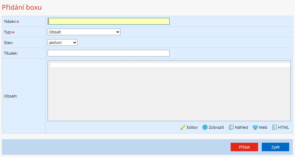
Adding a box is based on the same principle as adding other items. A page with a form will open, where you fill in the required information and choose the boy type. After changing the box type, the required items, specific to each type, also change.
It is always necessary to fill in the name of the box, which then serves to identify the box in the list.
It is also necessary to choose the box type, see the previous chapter for details.
You can inactivate the box in the Status column, which will hide it from viewing, but it will remain available in the CMS.
Other items change dynamically, depending on the box type.

Example of adding of the Content type box, i.e. the basic type.
